학습 리스트
- 내부/외부/인라인 CSS
- 선택자(Selector), 속성(Property), 값(Value)
- 선택자의 네 가지 종류
- Font 속성과 box의 크기 조절
- padding과 margin
- box의 속성들: box-sizing, border-radius, border, opacity
- 가운데 정렬하기
- Font 변경하기
- 색상
1. 내부/외부/인라인 CSS
(1) 내부 CSS
<!-- 001.html -->
<!DOCTYPE html>
<html lang="en">
<head>
    <meta charset="UTF-8">
    <title>Document</title>
    <style>
        h1{color:red}
    </style>
</head>
<body>
    <h1>hello world</h1>

</body>
</html>
다음과 같이 입력하는 경우 아래와 같은 결과가 나온다.

하지만 html에 스타일을 작성하게 되면 문서의 복잡성과 유지보수의 문제도 있다. 그렇다면 html에서 style부분을 다른 css파일로 만들고 이를 연결해보자.
(2) 외부 CSS
<001.css>
h1{color:red};<001.html>
<!DOCTYPE html>
<html lang="en">
<head>
    <meta charset="UTF-8">
    <title>Document</title>
    <link rel="stylesheet" href="001.css">
</head>
<body>
    <h1>hello world</h1>
</body>
</html>
이렇게 작성하면 동일한 결과가 나오는 것을 확인할 수 있다. (1)의 방법은 내부 CSS이고, (2)의 방법은 외부 CSS이다.
(3) 인라인 CSS
h1에서 바로 직접적으로 style을 연결할 수도 있다. 이러한 방법을 인라인 CSS라고 한다. 라인에 바로 입력하는 것이다.
<!DOCTYPE html>
<html lang="en">
<head>
    <meta charset="UTF-8">
    <title>Document</title>
    <!-- <link rel="stylesheet" href="001.css"> -->
    <!-- <style>
        h1{color:red};
    </style> -->
</head>
<body>
    <h1 style="color:red">hello world</h1>
</body>
</html>
이 방법이 직관적이고 간편해보이지만, 우리가 원하는 요소에 하나하나 정의를 해야하는 불편함이 있으며, 내용과 스타일이 분리가 되지 않기 때문에 유지보수가 어렵다.
또한 css에서의 주석은 /* 주석 */ 형태이다.
2. 선택자(Selector), 속성(Property), 값(Value)
우선 우리는 내부CSS를 우선적으로 작성해본다.
<!DOCTYPE html>
<html lang="en">
<head>
    <meta charset="UTF-8">
    <title>Document</title>
    <style>h1, h2, h3{color:skyblue;}</style>
</head>
<body>
    <!-- h${hello world}*6 -->
    <h1>hello world</h1>
    <h2>hello world</h2>
    <h3>hello world</h3>
    <h4>hello world</h4>
    <h5>hello world</h5>
    <h6>hello world</h6>
</body>
</html>
여기서 h1, h2, h3은 선택자(Selector)라고 하고, color와 같은 것은 속성(Property), skyblue는 값(Value)라고 부른다.
3. 선택자의 네 가지 종류
선택자에는 네 가지 종류가 있다.
- 범용 선택자 : (*) 모든 선택자를 지칭할 경우
- 타입 선택자 : 특정 태그만을 지칭할 경우
- class 선택자 : (.) 동일한 여러 태그 중에서 특정 태그만 지칭할 경우. class 중첩사용 가능.
- id 선택자 : (#) 동일한 여러 태그 중에서 특정 태그만 지칭할 경우. id 중첩사용 불가, 하나의 페이지에서 하나의 선택자에만 사용 가능.
<예시1 : 범용선택자>
<!DOCTYPE html>
<html lang="en">
<head>
    <meta charset="UTF-8">
    <title>Document</title>
    <style>
        * {color:red;}
    </style>
</head>
<body>
    <h1>hello world</h1>
    <!-- p{hello world}*4 -->
    <p>hello world</p>
    <p>hello world</p>
    <p>hello world</p>
    <p>hello world</p>
</html>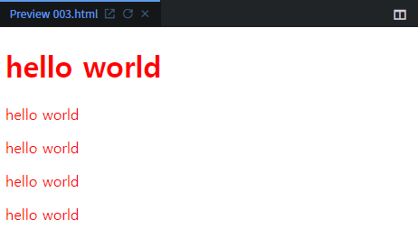
<예시2 : 타입 선택자>
<!DOCTYPE html>
<html lang="en">
<head>
    <meta charset="UTF-8">
    <title>Document</title>
    <style>
        h1 {color:red;}
    </style>
</head>
<body>
    <h1>hello world</h1>
    <!-- p{hello world}*4 -->
    <p>hello world</p>
    <p>hello world</p>
    <p>hello world</p>
    <p>hello world</p>
</html>
<예시3 : 클래스 선택자>
<!DOCTYPE html>
<html lang="en">
<head>
    <meta charset="UTF-8">
    <title>Document</title>
    <style>
        .one {color:red;}
    </style>
</head>
<body>
    <h1>hello world</h1>
    <!-- p{hello world}*4 -->
    <p>hello world</p>
    <p>hello world</p>
    <p class="one">hello world</p>
    <p>hello world</p>
</html>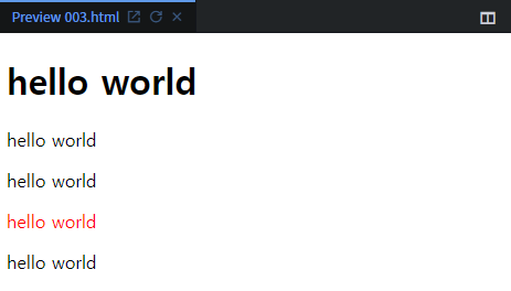
class의 "one"에 해당하는 선택자만 스타일이 바뀌는 것을 확인할 수 있다.
하지만 아래와 같이 여러 class를 적용할 수도 있다.
<!DOCTYPE html>
<html lang="en">
<head>
    <meta charset="UTF-8">
    <title>Document</title>
    <style>
        .one {color:red;}
        .two {border:solid 1px black;}
    </style>
</head>
<body>
    <h1>hello world</h1>
    <!-- p{hello world}*4 -->
    <p>hello world</p>
    <p>hello world</p>
    <p class="one two">hello world</p>
    <p class="one">hello world</p>
</html>
<예시4 : id 선택자>
<!DOCTYPE html>
<html lang="en">
<head>
    <meta charset="UTF-8">
    <title>Document</title>
    <style>
        .one {color:red;}
        .two {border:solid 1px black;}
        #three{font-style:italic;}
        #four{font-size:100px;}
    </style>
</head>
<body>
    <h1 id="three">hello world</h1>
    <!-- <h1 id="three four">hello world</h1>
    여러 id를 적용하게 되면 아예 적용되지 않는다 -->

    <!-- p{hello world}*4 -->
    <p>hello world</p>
    <p>hello world</p>
    <p class="one two">hello world</p>
    <p class="one">hello world</p>
</html>
또한 다른 선택자(ex. p)에 id="three"를 사용해도 적용이 안된다. 한 페이지에서 단 하나의 선택자에서만 사용할 수 있기 때문이다.
4. Font 속성과 box의 크기 조절
(1) font-size : px, em, rem
<!DOCTYPE html>
<html lang="en">
<head>
    <meta charset="UTF-8">
    <title>Document</title>
    <style>
        .one{}
        .two{}
        .three{}
    </style>
</head>
<body>
    <!-- p{hello world}*2 -->
    <p class="one">hello world</p>
    <p class="two">hello world</p>
    <h1 class="three">hello world</h1>
</body>
</html>
이를 개발자도구로 보게 되면, h1은 Font는 32px에 맑은고딕체라고 나온다.

따라서 class one의 font-size를 32px로 변경해보면 h1와 크기가 같아짐을 알 수 있다. 또 class two에 2em으로 변경해보면 이 또한 크기가 h1와 class one과의 크기가 같아짐을 알 수 있다. 왜 그럴까?
px는 고정단위이고, em은 배수단위이다. body의 <p>의 기본 px이 16px이기 때문에 2em을 하게 되면 32px가 되는 것이다. 만약 0.5em으로 두면 font-size는 8px로 바뀌게 된다. 따라서 em은 부모의 font-size의 배수단위가 된다.
<!DOCTYPE html>
<html lang="en">
<head>
    <meta charset="UTF-8">
    <title>Document</title>
    <style>
        .one{font-size:32px;}
        .two{font-size:2em;}
        .three{}
    </style>
</head>
<body>
    <!-- p{hello world}*2 -->
    <p class="one">hello world</p>
    <p class="two">hello world</p>
    <h1 class="three">hello world</h1>
</body>
</html>
만약 아래와 같이 코드를 작성하게 되면 어떻게 될까?
<!DOCTYPE html>
<html lang="en">
<head>
    <meta charset="UTF-8">
    <title>Document</title>
    <style>
        .one{font-size:32px;}
        .two{font-size:2em;}
        .three{font-weight: normal;}
        div{font-size:8px;}
    </style>
</head>
<body>
    <!-- p{hello world}*2 -->
    <p class="one">hello world</p>
    <div>
        <p class="two">hello world</p>
    </div>
    <h1 class="three">hello world</h1>
</body>
</html>
결과는 다음과 같이 중간 폰트의 크기가 8px로 나타나게 된다. 왜일까?
왜냐하면 p는 부모인 <div>로 감싸주고 있다. 여기서 div의 속성을 보면 font-size:8px로 고정해두었다. 따라서 부모의 font-size가 8px이므로 여기서 자식인 p가 class two에 따라 부모의 크기에 2em만큼 두 배로 폰트를 키워도 16px이 되므로 16px가 나타나게 되는 것이다.
이처럼 em은 부모의 영향을 너무 많이 받는다. 그래서 만약 한 가지 기준점을 두고 기준점에 의해 배수 단위를 쓰고 싶은 경우 "rem"을 사용하면 된다. rem은 body의 font-size에 의해서만 영향을 받는다.
따라서 이전의 코드에서 2em -> 2rem으로 변경하게 되면, 아래 결과 이미지와 같이 32px로 뜨게 된다. body의 기본 속성이 16px이므로 body의 font-size에 영향을 받아 이의 두 배를 해준 크기이기 때문이다.
<!DOCTYPE html>
<html lang="en">
<head>
    <meta charset="UTF-8">
    <title>Document</title>
    <style>
        .one{font-size:32px;}
        .two{font-size:2rem;}
        .three{font-weight: normal;}
        div{font-size:8px;}
    </style>
</head>
<body>
    <!-- p{hello world}*2 -->
    <p class="one">hello world</p>
    <div>
        <p class="two">hello world</p>
    </div>
    <h1 class="three">hello world</h1>
</body>
</html>
(2) font-weight : normal, bold
또한 h1처럼 font의 두께를 조절하고 싶다면 font-weight를 조절하면 된다. h1의 경우 p처럼 두께를 얇게 하고 싶다면, font-weight: normal; 이라 작성하자. 그러면 아래와 같이 세 폰트의 두께가 같아진다.

(3) box : width - px , %, vw / height - px, vh
<!DOCTYPE html>
<html lang="en">
<head>
    <meta charset="UTF-8">
    <title>Document</title>
    <style>
        .one{font-size:32px;}
        .two{font-size:2rem;}
        .three{font-weight: normal;}
        div{font-size:8px;}
        .box-one{}
        .box-two{}
    </style>
</head>
<body>
    <!-- p{hello world}*2 -->
    <p class="one">hello world</p>
    <div>
        <p class="two">hello world</p>
    </div>
    <h1 class="three">hello world</h1>
    <!-- .box-one -->
    <div class="box-one"></div>
    <!-- .box-two -->
    <div class="box-two"></div>
</body>
</html>
html의 body에서 .box-one 과 .box-two를 각각 입력하고 tab을 누르게 되면 위 코드와 같이 자동으로 <div>로 감싸지게 된다.
box의 속성 중 width와 height를 나타내는 가장 기본적인 단위는 폰트와 동일하게 "px"이다. 이 역시 고정값이다. 예시로 아래의 .box-one을 보면 된다.
다른 방법으로는 "%"가 있다. 이는 부모가 가진 크기에 영향을 받는다. 하지만 이 단위는 width만 가능하고 height는 %를 인지하지 못하므로 사용할 수 없다.
마지막으로 현재 사용자가 보는 화면의 크기에 따라 결정되는 단위가 있다. width는 "vw", height는 "vh"이다. 이들 앞의 숫자로 사용자의 화면 크기에서 몇 퍼센트의 크기인지 결정해준다.
<!DOCTYPE html>
<html lang="en">
<head>
    <meta charset="UTF-8">
    <title>Document</title>
    <style>
        .one{font-size:32px;}
        .two{font-size:2rem;}
        .three{font-weight: normal;}
        div{font-size:8px;}
        .box-one{
            width:200px;
            height:100px;
            background-color:green;
        }
        .box-two{
            /* 부모가 가진 width의 50% */
            /* width:50%; */
            /* 부모가 가진 width에 영향받지 않고, 전체 보이는 화면의 절반 높이만을 할당받게 된다 */
            width:50vw;
            /* 높이는 %를 인지를 못하므로 나타나지 않는다 */
            /* height:10%; */

            /* 현재 내가 보이는 화면의 전체 높이의 30%를 할당받음 */
            height: 30vh;
            background-color:red;
        }
    </style>
</head>
<body>
    <!-- p{hello world}*2 -->
    <p class="one">hello world</p>
    <div>
        <p class="two">hello world</p>
    </div>
    <h1 class="three">hello world</h1>
    <!-- .box-one -->
    <div class="box-one"></div>
    <!-- .box-two -->
    <div class="box-two"></div>
</body>
</html>
5. padding과 margin
(1) padding
<!DOCTYPE html>
<html lang="en">
<head>
    <meta charset="UTF-8">
    <title>Document</title>
    <style>
        h1{
            border: solid 10px black;
        }
    </style>
</head>
<body>
    <h1>hello world</h1>
</body>
</html>
위 코드의 실행 결과를 보면, 다음과 같이 text를 드래그 했을 때 border와의 너비가 없이 바로 붙어있음을 알 수 있다. 그렇다면 border와 파란색 드래그와의 간격을 띄워보도록 하자. "padding"속성을 이용하면 이 기능을 구현할 수 있다.
네 방향 모두 패딩을 주고 싶은 경우 - padding: 위 오 아래 왼; (12시 기준으로 오른쪽 방향으로 간다고 생각하자)
-> padding: 20px; 모두 같은 방향으로 같은 패딩을 주고 싶은 경우, 한 값만 입력함.
-> padding: 20px 20px; (상하 좌우) horizontal, vertical에 같게 주고 싶은 경우
한 방향에만 패딩을 주고 싶은 경우 - padding-top/right/bottom/left: 20px;
<!DOCTYPE html>
<html lang="en">
<head>
    <meta charset="UTF-8">
    <title>Document</title>
    <style>
        h1{
            border: solid 10px black;
            /* 12시 기준으로 오른쪽 방향으로 (위, 오, 아래, 왼) */
            /* padding: 5px 10px 15px 20px; */
            padding-top: 20px;
            padding-right: 20px;
            padding-bottom: 20px;
            padding-left:20px;
        }
    </style>
</head>
<body>
    <h1>hello world</h1>
</body>
</html>
(2) margin
그렇다면 text의 border로부터 바깥의 간격을 띄우고 싶을 경우는 어떻게 하면 될까? 그런 경우 "margin"을 사용한다. 이의 사용법은 padding과 동일하다.
<!DOCTYPE html>
<html lang="en">
<head>
    <meta charset="UTF-8">
    <title>Document</title>
    <style>
        h1{
            border: solid 10px black;
            padding: 20px;
            margin: 20px;
            /* margin: 20px 20px; */
            /* margin: 5px 10px 15px 20px; */
        }
    </style>
</head>
<body>
    <h1>hello world</h1>
    <h1>hello world</h1>
</body>
</html>

6. box의 속성들 : box-sizing, border-radius, border, opacity
(1) box-sizing
아래 코드를 보자. (1) 빨간색 박스는 padding을, (2) 초록색 박스는 margin을 주었다. 세 박스 중 어느 박스가 가장 클까?
<!DOCTYPE html>
<html lang="en">
<head>
    <meta charset="UTF-8">
    <title>Document</title>
    <style>
        .one{
            padding:20px;
            width:200px;
            height:200px;
            background-color:red;
        }
        .two{
            margin:20px;
            width:200px;
            height:200px;
            background-color:green;
        }
        .three{
            width:200px;
            height:200px;
            background-color:blue;
        }
    </style>
</head>
<body>
    <div class="one"></div>
    <div class="two"></div>
    <div class="three"></div>

</body>
</html>
보시다시피, (빨간색 박스가 가장 크고, 초록색과 파란색 박스는 크기가 같다. (1) > (2) = (3)
다른 예제 하나를 더 보자. 아래 예제는 border를 추가한 것이다. border를 추가하였을 때 박스의 크기는 어떻게 될까? border의 두께도 박스의 크기에 포함될까?
<!DOCTYPE html>
<html lang="en">
<head>
    <meta charset="UTF-8">
    <title>Document</title>
    <style>
        .one{
            border: solid 20px black;
            padding:20px;
            width:200px;
            height:200px;
            background-color:red;
        }
        .two{
            border: solid 20px black;
            margin:20px;
            width:200px;
            height:200px;
            background-color:green;
        }
        .three{
            border: solid 20px black;
            width:200px;
            height:200px;
            background-color:blue;
        }
    </style>
</head>
<body>
    <div class="one"></div>
    <div class="two"></div>
    <div class="three"></div>

</body>
</html>
결과, (1) 280 x 280. (= (padding 20px + border 20px) * 2 + width/height 200px)
(2) 240 x 240. (= border 20px * 2 + width/height 200px)
(3) 240 x 240. (= border 20px * 2 + width/height 200px)
이처럼 전체 넓이를 계산하는 것은 어려워 진다. 만약 전체 넓이를 border 기준으로 하고 싶다면, 즉 넓이를 딱 200px로 정했을 때 200px에 맞게끔 박스 넓이가 그려지길 바란다면 "box-sizing"을 사용하면 된다.
만약 다음과 같이 box-sizing: border-box; 를 추가하게 되면, 아래와 같이 박스의 크기가 정확하게 200px만큼의 사각형이 그려지게 된다. 이전 그림과 비교했을 때 확실히 작아졌다는 것을 알 수 있다. 이렇게 하면 우리는 넓이를 계산할 필요가 없다. 왜냐하면 무조건 (1)의 넓이는 200 x 200이 되기 때문이다.
<style>
	.one{
            box-sizing: border-box;
            border: solid 20px black;
            padding:20px;
            width:200px;
            height:200px;
            background-color:red;
        }
 </style>
즉, box-sizing은 사각형의 넓이에 영향을 미치는 padding, border에 상관없이 원하는 사각형의 넓이로 고정하고 싶을 때 사용한다.

(2) border-radius
border-radius:에 값을 주게 되면 모서리에 변화가 생긴 것을 확인할 수 있다. 이처럼 border-radius는 얼만큼 깎아서 원에 가깝게 나타낼 것인지를 정하는 것이다.
<style>
	.two{
            border: solid 20px black;
            border-radius: 20px;
            margin:20px;
            width:200px;
            height:200px;
            background-color:green;
        }
</style>
(3) border
<선의 종류>
- solid : - 실선
- double: = 겹선
- dotted: . . . . . . . 점 점선
- dashed: - - - - - 긴 점선
- groove: 바깥 명암 추가 (검정일 경우 나타나지 않는다)
- ridge: 안 명암 추가 (검정 x)
- inset: 버튼이 눌린 듯한 효과 (검정 x)
- outset: 버튼이 눌리지 않은 듯한 효과 (검정 x)
<예시>
<style>
	.two{
    	...
        border: outset 20px gray;
        ...
    }
</style>
(4) opacity
opacity: 투명도 조절하여 흐릿하게 만든다. 글자도 함께 영향을 받는다.
- 1에 가까울수록 뚜렷하고, 0에 가까울 수록 흐릿해진다.
<예시>
<head>
	<style>
    	  .one{
        	  ...
          	opacity: 0.5;
         	 ...
   	 	  }
 	 </style>
</head>
<body>
	<div class="one">hello world</div>
</body>

7. 가운데 정렬하기
(1) margin: 0px auto; - 중앙 정렬
<!DOCTYPE html>
<html lang="en">
<head>
    <meta charset="UTF-8">
    <title>Document</title>
    <style>
        .container{
            width:200px;
            height:200px;
            background-color:skyblue;
        }
    </style>
</head>
<body>
    <div class="container"></div>
</body>
</html>
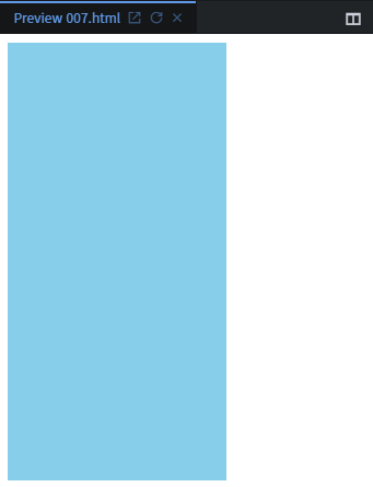
우리의 목표는 위 도형을 가운데 정렬을 하는 것이다.
위의 코드를 짠 후 개발자 도구로 결과를 보게 되면 다음과 같이 박스 오른쪽도 함께 표시된다. 이는 body영역 안에 <div>가 위에 표시된 만큼 전체 영역을 가지고 있다는 것이다. 이를 증명하는 방법은 아래와 같다.
다음과 같이 컨테이너를 하나 더 추가하게 되면 이전 컨테이너의 오른쪽에 배치되지 않고 아래로 내려가는 것을 볼 수 있다. 왜냐하면 이전의 컨테이너 하나가 오른쪽 영역도 모두 가지고 있기 때문에 새로 추가된 컨테이너가 오른쪽에 배치되지 못하고 내려가게 되는 것이다.
    <style>
        .container{
            width:200px;
            height:200px;
            background-color:skyblue;
            margin: 0px auto;
        }
    </style>
위처럼 margin을 0px auto로 주게 되면 컨테이너가 가운데 정렬 된다.

하지만 가로로 가운데 정렬은 가능하지만, 세로로 가운데 정렬은 불가하다. 아까 개발자 도구에서 컨테이너가 가지는 영역을 확인했듯 컨테이너는 가로로만 영역을 확장하여 가지기 때문이다.
위처럼 추가한 코드는, 컨테이너가 가진 전체 넓이에서 상하는 0px, 좌우는 auto를 줬기 때문에 중앙 정렬이 된 것이다.
(2) position, margin으로 가운데 정렬하기
<!DOCTYPE html>
<html lang="en">
<head>
    <meta charset="UTF-8">
    <title>Document</title>
    <style>
        .container{
            width:200px;
            height:200px;
            background-color:skyblue;
        }
        .one{
            width:200px;
            height:200px;
            background-color:red;
        }
        .two{
            width:200px;
            height:200px;
            background-color:blue;
        }
    </style>
</head>
<body>
    <div class="container"></div>
    <div class="one"></div>
    <div class="two"></div>
</body>
</html>
다음과 코드를 작성하게 되면 다음과 같은 출력이 나온다. 하지만 각 상자에 position: absolute항목을 추가해보자.
<!DOCTYPE html>
<html lang="en">
<head>
    <meta charset="UTF-8">
    <title>Document</title>
    <style>
        .container{
            width:200px;
            height:200px;
            background-color:skyblue;
            position:absolute;
        }
        .one{
            width:200px;
            height:200px;
            background-color:red;
            position:absolute;
        }
        .two{
            width:200px;
            height:200px;
            background-color:blue;
            position:absolute;
        }
    </style>
</head>
<body>
    <div class="container"></div>
    <div class="one"></div>
    <div class="two"></div>
</body>
</html>
결과는 다음과 같이 세 상자가 겹치게 된다. 왜냐하면 absolute를 하게 되면 각각의 기준점에 놓이게 된다. 예시에서는 각 상자가 모두 기준점이 body로 동일하므로 같은 곳에 모이게 되어 겹친다.
<!DOCTYPE html>
<html lang="en">
<head>
    <meta charset="UTF-8">
    <title>Document</title>
    <style>
        .container{
            width:200px;
            height:200px;
            background-color:skyblue;
            position:absolute;
            top:10px;
            left:10px;
        }
        .one{
            width:200px;
            height:200px;
            background-color:red;
            position:absolute;
            top:20px;
            left:20px;
        }
        .two{
            width:200px;
            height:200px;
            background-color:blue;
            position:absolute;
            top:30px;
            left:30px;
        }
    </style>
</head>
<body>
    <div class="container"></div>
    <div class="one"></div>
    <div class="two"></div>
</body>
</html>
각 상자를 10px, 20px, 30px씩 위와 왼쪽으로 밀어낸 결과를 보아 이전 화면이 세 상자가 겹쳐있었다는 사실이 확인된다. 이를 이용하여 가운데 정렬을 할 수도 있다.
우선은 기준점을 먼저 선정해보자. 이전에는 기준점이 모두 한 곳으로 동일하여 겹쳐졌었다. 그렇다면 각 상자의 기준점을 다르게 해보자. 그러기 위해서는 기준점이 될 div가 필요하다. 우리는 container를 기준점으로 삼아볼 것이다. 그러기 위해서는 container의 position: relative로 수정한다. 그리고 아래에 같은 container를 복사하여 놓는다. 여기서 one과 two 상자가 겹치게 되므로 잘 보이기 위해 width와 height를 100px로 수정한다.
<!DOCTYPE html>
<html lang="en">
<head>
    <meta charset="UTF-8">
    <title>Document</title>
    <style>
        .container{
            width:200px;
            height:200px;
            background-color:skyblue;
            position:relative;
            top:10px;
            left:10px;
        }
        .one{
            width:100px;
            height:100px;
            background-color:red;
            position:absolute;
            top:20px;
            left:20px;
        }
        .two{
            width:100px;
            height:100px;
            background-color:blue;
            position:absolute;
            top:30px;
            left:30px;
        }
    </style>
</head>
<body>
    <div class="container">
        <div class="one"></div>
        <div class="two"></div>
    </div>
    <div class="container">
        <div class="one"></div>
        <div class="two"></div>
    </div>
</body>
</html>
그 결과, 다음과 같이 위 아래 각 상자의 기준점이 빨간색 동그라미로 위치가 다르게 되었다. 따라서 absolute의 기준점을 선정하는 방법은 부모의 relative를 선정해주는 것이다.
- parent - position: absolute
- child - position: relative
absolute만 사용하여 중앙 정렬도 할 수 있다. top과 left를 50%로 변경해주는 것이다. 이는 위에서 부터 50%아래로, 옆에서부터 50% 밀리게 된다. 현재 코드에서 빨간 상자에 이를 적용하게 되면 다음과 같이 나타나게 된다.
<style>
        .one{
            width:100px;
            height:100px;
            background-color:red;
            position:absolute;
            top:50%;
            left:50%;
        }
</style>
즉, 부모의 200px에서 50%인 100px만큼 밀리게 된 상태이다.
여기서 좀 더 잘 보기 위해 부모인 container의 크기를 600 x 600으로 키워보자. 결과는 아래와 같다. (아래 복사한 상자들도 지웠다).

부모인 container의 크기가 600 x 600이므로 이의 50%인 300px만큼 밀린 모습이다. 빨간색 크기가 100px이므로 빨간색 왼쪽과 아래의 공간은 200px이 된다.
그렇다면 빨간색 상자는 왼쪽으로 얼만큼 이동해야 중앙 정렬이 될까? 물론 percent로 계산할 수도 있지만, margin으로도 계산할 수도 있다. 현재 상자는 위로 -50px, 왼쪽으로 -50px 이동해야 한다. 따라서 margin: -50px 라고 입력하면 중앙 정렬이 된다.
<!DOCTYPE html>
<html lang="en">
<head>
    <meta charset="UTF-8">
    <title>Document</title>
    <style>
        .container{
            width:600px;
            height:600px;
            background-color:skyblue;
            position:relative;
            top:10px;
            left:10px;
        }
        .one{
            width:100px;
            height:100px;
            background-color:red;
            position:absolute;
            margin: -50px;
            top:50%;
            left:50%;
        }
        .two{
            width:100px;
            height:100px;
            background-color:blue;
            position:absolute;
            top:30px;
            left:30px;
        }
    </style>
</head>
<body>
    <div class="container">
        <div class="one"></div>
        <div class="two"></div>
    </div>
</body>
</html>
(3) weight, height: 0; / margin: auto;
좀 더 응용해보자.
<!DOCTYPE html>
<html lang="en">
<head>
    <meta charset="UTF-8">
    <title>Document</title>
    <style>
        .container{
            width:100px;
            height:100px;
            background-color:skyblue;
            position:absolute;
            top:0;
            bottom:0;
            left:0;
            right:0;
        }
    </style>
</head>
<body>
    <div class="container">
    </div>
</body>
</html>
결과로 다음과 같이 상하좌우 각 요소들이 붙은 모습이 된다. 여기서 margin: auto;를 줘보자. 아까 예시에는 margin을 줄 수 있는 영역이 상하는 없었다. 하지만 이 예제의 경우에는 top과 bottom이 모두 0으로 붙어있으므로 줄 수 있게 된다.
<!DOCTYPE html>
<html lang="en">
<head>
    <meta charset="UTF-8">
    <title>Document</title>
    <style>
        .container{
            width:100px;
            height:100px;
            background-color:skyblue;
            position:absolute;
            top:0;
            bottom:0;
            left:0;
            right:0;
            margin: auto;
        }
    </style>
</head>
<body>
    <div class="container">
    </div>
</body>
</html>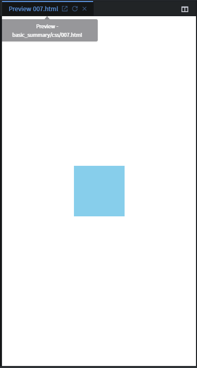
이의 장점은 브라우저 창의 크기와 상관없이 무조건 중앙 정렬이 된다는 것이다.
만약 여기서 width와 height를 없앤다면 전체 화면을 꽉 채우게 된다. 따라서 배경으로 사용할 수도 있다.
- 중앙 정렬: width: 0; / height: 0; / margin: auto;
- 배경화면 사용: width, height (x) / margin: auto;
8. Font 변경하기
아래 사이트에서 구글 폰트를 둘러볼 수 있다.
Google Fonts
Making the web more beautiful, fast, and open through great typography
fonts.google.com
마음에 드는폰트를 누르고 이의 link와 css를 복사하여 코드에 붙여넣어보자.

<!DOCTYPE html>
<html lang="en">
<head>
    <meta charset="UTF-8">
    <title>Document</title>
    <link href="https://fonts.googleapis.com/css2?family=Do+Hyeon&display=swap" rel="stylesheet">
    <style>
        h1{font-family: 'Do Hyeon', sans-serif;}
    </style>
</head>
<body>
    <h1>
        안녕하세요 HI
    </h1>
</body>
</html>
폰트가 잘 적용된다.
9. 색상
아래 사이트에서 여러가지 색상들을 둘러볼 수 있다.
HTML Color Names
HTML Color Names Color Names Supported by All Browsers All modern browsers support the following 140 color names (click on a color name, or a hex value, to view the color as the background-color along with different text colors): Click here to see the 140
www.w3schools.com
위 사이트의 색상들은 모두 16진법으로 표현되어 있다. 이를 어떻게 적용할 수 있을까?

아시다시피 각 두 자리씩 R, G, B를 나타낸다. 따라서 #ff0000은 빨간색을, #000000은 검정색을, #ffffff은 흰색이다. 단축하여 #f00, #000, #fff로 나타낼 수도 있다.
혹은 아래 사이트에서 원하는 색상을 고를 수도 있다.
HTML 컬러 코드
HTML 컬러 차트 사각형 모양의 컬러버튼을 클릭하여 HTML 컬러 코드를 찾으세요. HTML 컬러 코드 이론 "이 이상한 기호와 숫자와의 조합이 어떤 의미가 있을까?" 하고 궁금하신가요. 그 답은 "예" 입��
html-color-codes.info
'Education' 카테고리의 다른 글
| [부스트 코딩 뉴비 챌린지 2020] FINAL 미션 02 : N의 약수로 N을 구하는 프로그램 (0) | 2020.08.21 |
|---|---|
| [부스트 코딩 뉴비 챌린지 2020] week6_LIVE 강의 (0) | 2020.08.21 |
| [부스트 코딩 뉴비 챌린지 2020] C언어: %p와 %x의 차이점은? (0) | 2020.08.18 |
| [부스트 코딩 뉴비 챌린지 2020] C언어: 포인터에 자료형은 왜 붙일까? (0) | 2020.08.18 |
| [제주코딩베이스캠프] 웹개발 30분 요약 - 5. 30분 요약시리즈 - HTML (0) | 2020.08.18 |

